Petrol Ofisi HQ

Manmade geology
Project name
Petrol Ofisi HQ
Year completion
2019
Client
Petrol Ofisi
Location
Istanbul, Turkey
Category
Workspace
Square meters
8010 m2
Functions
Interior Design, Concept, FF&E and Craft
Collaborations
Photography © Ali Bekman Video © Marc Castañé Graphic Design © Lagranja Design

The Challenge
How do you express a concept as natural as geology in a manmade structure?
This was the challenge behind the new HQ for Petrol Ofisi, Turkey’s leading fuel distribution company. Using this question as a starting point, Lagranja Design has come up with stylish new corporate offices for the company in Istanbul.
The Lagranja team had many factors to consider; namely timelessness, well being for the company’s employees, and optimal organisation of over 8,000 square metres of office space.


The new HQ is situated Emaar AVM; a mega, mixed-used complex on the Asian side of the Bosporus. An initial study on the scale of ‘internal urbanism’ was undertaken by the studio in order to optimize internal traffic flows and organise the different departments over three floors in a fluid and dynamic way.
Main outcomes of this phase included a cluster of meeting rooms on each floor, along with acentral patio for the internal stairs, which promote pedestrian traffic and minimize dependence on elevators.


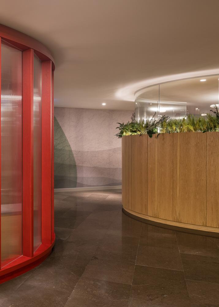
As is a feature of all Lagranja projects, custom made elements play a major part. Carpet and wallpaper – which was used as an ‘external skin’ in the modular bathroom units – feature a flowing lava pattern, and pillars made of dark olive marble were hammered and brushed in order to bring out the textural characteristics of geological layers.
Natural materials come to the fore in the shape of oak wood cupboards that double as workspace dividers, and in the 400- square metre executive zone, another layer of tonality was employed with a darker wood along with more premium, grey-ish coloured textiles and finishes.


Visual identity
Visually, the driving force behind the project is layering, a reference to the geological nature of the oil industry. Stonewalls, tectonic plates and stratification were the visual cues for the project, executed in natural and manmade materials with a ‘sexy’ sensibility and colour scheme that draws from the murky, mysterious palate of the earth sciences.
Each of the three levels of the project has been rendered a different tone, from green to petrol blue and red, the company’s corporate colour. Red has also been used in a wide range of furniture and details, legs of worktables, armchairs in the cafeteria, and the lining of the 16 elevators – providing striking aesthetic unison.


